Bannistar worked on defining the brand values, creating the worldview, brand logo, brand statement, product naming, and packaging for Chuoken Senbei Inc.’s rice cracker brand “Kirinosaka”. Chuoken Senbei, Inc. is a rice cracker maker founded in Tokyo in 1923.
They have developed and sold various Okaki products suitable for each era through exploring the best ways to convey the great taste of rice crackers while valuing Japan’s unique food culture. From 2011, Chuoken Senbei launched the brand “Kirinosaka Chuoken” that inherited the tradition of making rice crackers and focused on the taste of its rice and ingredients. They decided to rebrand “Kirinosaka” in order to increase its brand value and attract younger customers.
“Repositioning rice crackers (Okaki)”
In order to rebrand “Kirinosaka Chuoken”, we needed to reconsider the positioning of Okaki itself.
Okaki is a snack that has been loved in Japan for many years. However, in the confectionary market where unique products such as international western-style sweets brands and confectionary brands produced by famous pâtissiers appear one after another, its presence was diminishing. This occurred especially among young people, who had the image of Okaki as a “nostalgic snack” that was always at their grandparents’ house when they were small, so we needed to show them what a “New Okaki” looks like.
Bannistar conducted qualitative surveys on women in their 30s and 40s for the rebranding of Kirinosaka Chuoken.
From the survey results, we decided on our target of “harmonious women who think about their family and friends, while still valuing time for themselves”
We created “Proposals for a new Okaki Time“ as our brand concept, aiming to create Okaki that these women will want to eat with their friends and family. By suggesting new ways to eat Okaki, such as with wine and beer or as a picnic snack, we aimed to break away from the traditional image of Okaki and reach the new audience.
We then worked on a brand logo, brand statement, and packaging to properly represent the new brand concept. We simplified the brand name to “Kirinosaka”, in order to reflect a brand worldview that is closer and more accessible to the target audience. We also have worked on the development of visual communication through Instagram.
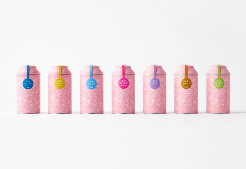
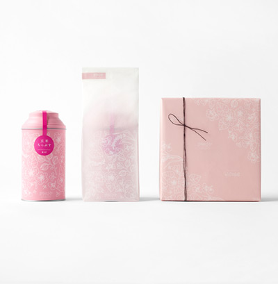
With packaging, we aimed to create something that represented both the “high quality” that Chuoken Senbei has pursued since its establishment, as well as a sweet uplifting tone based on the design theme of “Tokimeki (Thrill) Generator”. We developed a “botanical pattern” in pink, which we used for packaging and various other designs.
The new Okaki brand “Kirinosaka” was born in this way, and after launching in the Shibuya Hikarie in Tokyo during the summer of 2018, it has been sold at department stores, street markets, and on the Chuoken Senbei website.
https://www.instagram.com/kirinosaka/
Our issue was how we could convince young people to try Kirinosaka Chuoken products, which values the flavor of rice and its original ingredients. Bannistar joined us at the start of our project, working on everything from brand strategy planning, various design developments, to planning and managing new products and promotions. We hope that many people, especially our target group of women, will know our beliefs and commitments, and that we can make many people smile through our products.
Chuoken Senbei, Inc. CEO Yamada Shu